
 CGEE Student Voice
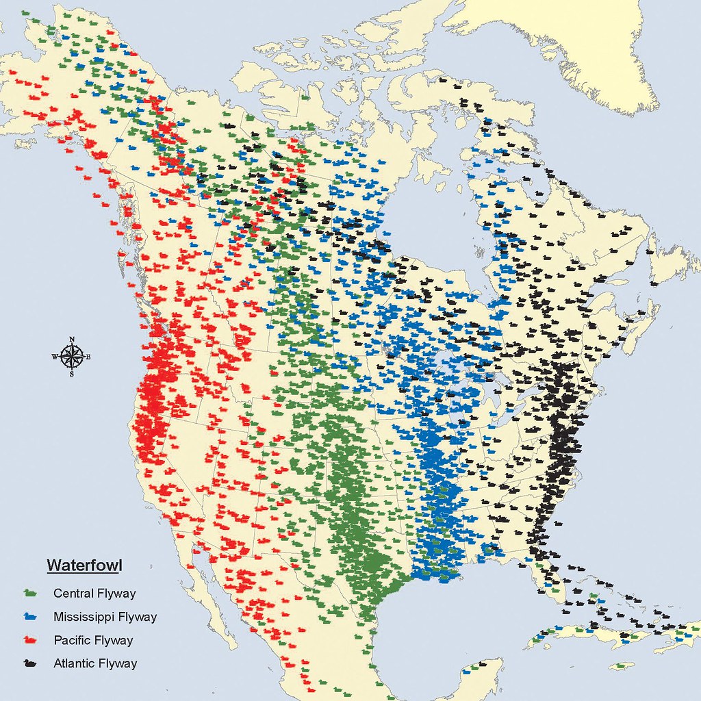
Environmental & Science Education
STEM
Nature of Science
Biodiversity
Miscellaneous
Edward Hessler
In 2015, the Cornell Laboratory of Ornithology made an observation about the range maps of birds. Today's maps are made of ink and paper, but tomorrow's maps will be made of pixels and data.
You can see what the lab meant when their data analysts took a deep look at NASA generated satellite maps and 12 million checklists submitted by 120,000 people to eBird.
The result are maps that are dazzling. The maps provide information about where birds are (seasonally), how their populations are doing and at a scale nearly fine enough that you can almost to pick out individuals. These maps are also dynamic.
Here is how to use eBird's newest tools. They will change the way you look at range maps. I hope you take a look and hit a few of the links.
No comments:
Post a Comment