
 CGEE Student Voice
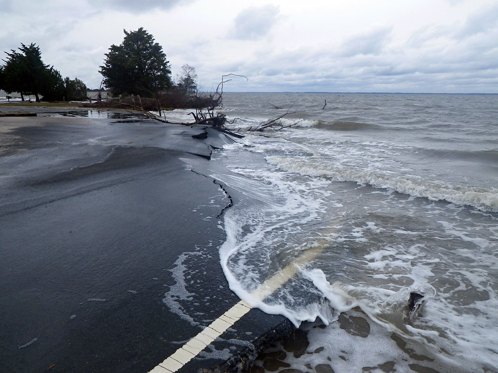
Environmental & Science Education
STEM
Climate Change
Edward Hessler
Earlier I made some comments on the recent release of the special report of Intergovernmental Panel on Climate Change (IPCC) on limiting global warming to 1.5 degrees C rather than 2 degrees C. Summary at bottom.
CarbonBrief extracted data from ~70 peer-reviewed journals to show the differences in effects between a 1.5 degrees C and a 2 degrees C change. The interactive chart is reported in categories and regions.
The categories include oceans, ice, temperature, rainfall, drought, storms and flooding, crops, nature, economy, and health.
The regions include Europe, Africa, Americas, Asia, Caribbean and small island states, China, and Australia.
Report Summary: Written by 91 scientists from forty-countries; 500 pp.; 6000 studies. There is a 30 page "Summary for Policy Makers" which is not an easy read but it is informative. The challenge in keeping global warming under 1.5 degrees C is to reduce global carbon emissions by 45 percent by 2030. This would require rapid, far-reaching, and unprecedented changes in all aspects of society, changes that should start now (even better 20 years ago!).
You may read this and think that there is a case for climate pessimism for which see here. This article contains some glimmers of optimism, e.g., Penn State's global climate expert Michael Mann suggests "focusing on achievable targets." For some (fewer) there is a case to be made for global optimism. Ryan Glaubke, a graduate student at Old Dominion University whose work encompasses ancient climates, is one for which see here.
No comments:
Post a Comment